User-Friendliness in Casino Games: How Navigation, Layout, and Intuitive Controls Are Evaluated

User-Friendliness in Casino Games: How Navigation, Layout, and Intuitive Controls Are Evaluated
When it comes to online casino games, the experience isn’t just about winning chances or flashy graphics—it’s also about how easy and enjoyable the game is to use. User-friendliness has become a key competitive factor in an industry where players can switch platforms in seconds if a site feels confusing or sluggish. This article explores how user-friendliness in casino games is evaluated, focusing on navigation, layout, and intuitive controls.
Navigation: The Path to a Seamless Experience
Good navigation is the foundation of a user-friendly casino game. Players should be able to find what they need quickly—whether that’s choosing a new game, checking promotions, or accessing support.
Top casino operators and game developers ensure that menus are logically structured and consistently placed. The main menu typically includes clear categories such as “Games,” “Promotions,” “Deposit,” and “Help.” Subcategories should be easy to understand and not buried behind too many clicks.
Another crucial aspect is visible feedback. When a player clicks a button, something should happen immediately—a color change, a sound, or a short animation confirming the action. This builds confidence and reduces the risk of misclicks.
On mobile devices, navigation is even more critical. Menus must be optimized for small screens, and key functions like “Play Now” or “Deposit” should always be accessible without covering the game itself.
Layout: Visual Balance and Clarity
A casino game’s layout is about more than aesthetics—it’s about creating clarity and comfort. A well-designed layout guides players naturally through the experience without overwhelming them with information.
A well-structured casino site or game interface has a clear visual hierarchy: the logo and main menu at the top, the game area in the center, and practical functions like login and balance clearly visible. Colors and contrasts are used to highlight what matters most—such as buttons for starting a game or activating a bonus—without distracting from the main content.
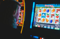
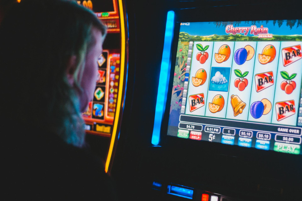
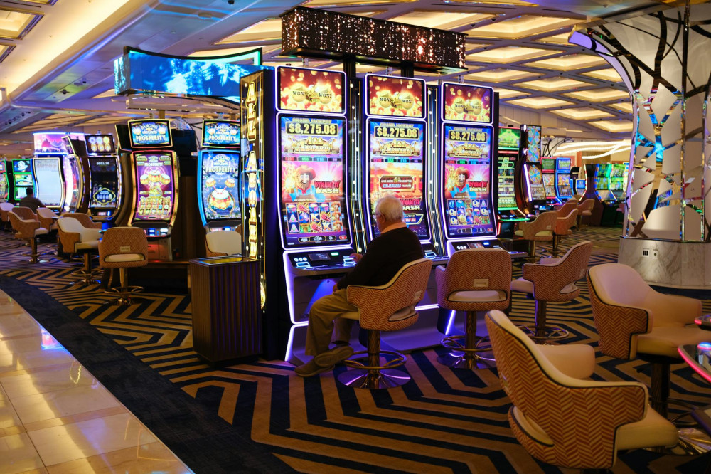
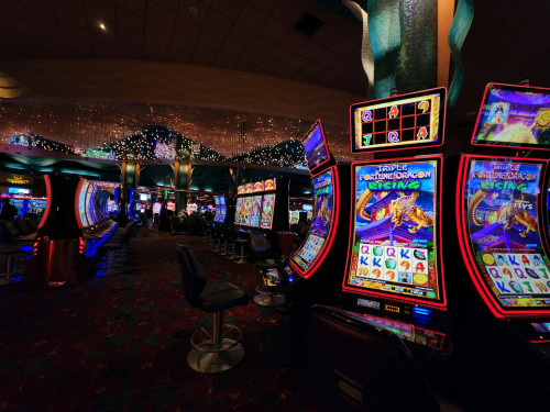
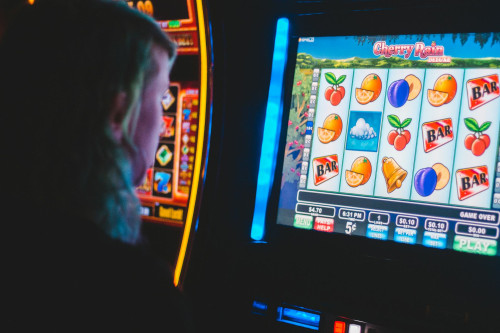
For games with many elements, such as slot machines with bonus rounds and special features, it’s essential that symbols and buttons are easy to recognize. Players should understand what’s happening without needing to read lengthy explanations.
A cluttered layout can quickly lead to frustration and cause players to leave. That’s why many developers now use focus groups or A/B testing to find the most intuitive design.
Intuitive Controls: When the Game Feels Natural
Intuitive controls mean that players instinctively know how to interact with the game—without having to think about it. This relies on familiar patterns and interactions that players already recognize from other digital experiences.
A classic example is the “spin” button in slot games. It’s almost always placed at the bottom center or bottom right—where a player’s finger naturally rests. Moving it to an unfamiliar spot can cause confusion, even if the design looks great.
Other examples of intuitive controls include:
- Clear icons—a gear for settings, a question mark for help.
- Consistent gestures—swiping, tapping, and dragging should work the same way across games.
- Automatic adjustments—the game should adapt to screen size and orientation without losing functionality.
When controls feel natural, players can focus on the fun of the game rather than figuring out how to play it.
Testing and Evaluation: Measuring User-Friendliness
User-friendliness can’t be judged by design alone—it must be tested in practice. Professional developers often use usability testing, where real players are observed as they navigate the game. These tests measure:
- How quickly players find specific features.
- How many errors or misunderstandings occur.
- How satisfied players feel after the session.
In addition, heatmaps and click data are used to analyze where players click most often and where they get stuck. This data helps developers see whether the layout works as intended or needs improvement.
The Overall Experience: When Design and Function Work Together
The best user experience happens when design, functionality, and technology align. A casino game can look stunning, but if it loads slowly or buttons respond poorly, players will lose interest fast.
Conversely, a simple design with quick response times and logical structure can deliver a far better experience—even without cutting-edge graphics. It’s all about balancing aesthetics and usability.
For players, good user-friendliness means less frustration, faster access to entertainment, and a greater sense of control. For operators, it means higher satisfaction, longer playtime, and stronger loyalty.
Læs også:


Conclusion: User-Friendliness as a Competitive Advantage
In a market with thousands of games and platforms, user-friendliness is no longer a luxury—it’s a necessity. Navigation, layout, and intuitive controls are the three pillars that determine whether a casino game feels professional and inviting or confusing and forgettable.
When developers and casino operators invest in understanding player behavior and needs, they create more than just attractive designs—they create experiences that feel natural, engaging, and trustworthy. And that’s what keeps players coming back.
Læs også: